
AER CELL™ Battery Company Identity

COMPREHENSIVE VISUAL BRANDING & WEBSITE PACKAGE
DISCIPLINE(S): UX/UI Design, Motion Design, Graphic Design
ROLE: Senior UX Designer
SKILLS & TOOLS: Sketching, Illustrator, Photoshop, Premiere, HTML/CSS/Javascript
AER CELL™ competes in the battery cell industry on transparency — straightforward, honest messaging in a market where competitors typically gate technical data behind logins and sales inquiries. My work built the visual system that made that transparency legible: x-ray imagery as a recurring motif, a bold color palette, and dual lighting environments that separate nontechnical from technical information.
Problem/Opportunity
The company's core differentiator — open, unguarded access to cell data — had no visual language to back it up. Providing the data openly was a business decision; making that openness feel like the point, on sight, was a design problem.
The existing AER logo no longer matched where the company was heading, creating a mismatch between the brand mark and the positioning it was supposed to represent.
Competitor sites hide technical detail behind logins and email inquiries, treating consumers and engineers with the same gated experience.
Goal
Build a visual identity where "transparency" wasn't just a claim in the copy but a motif expressed through imagery, layout, and interaction.
Solve the dual-audience problem — nontechnical customers and technical evaluators want fundamentally different depths of information — through the interface itself, rather than through separate sites or hidden menus.
Impact
Cell data is presented openly on the front page, a direct visual and structural break from competitor norms.
A dual-lighting system now does double duty as both a design signature and functional information architecture: light theme carries introductory and descriptive content, dark theme carries the technical "behind the scenes" data — meaning the visual system itself communicates what kind of information a visitor is looking at, before they've read a word.

Eschewing competitors’ tendency to hide information behind logins and email inquiries, AER CELL™ provides crucial cell data openly on the front page.

Complementary lighting themes simplify messaging for customers: light theme for introductory/explanatory/descriptive text, and dark theme for a ‘look behind the scenes’ at the technical data.
Logo, Color Palette & Typography

Imagery, Textures & Assets
The x-ray motif extends beyond the logo into the broader visual system — imagery and textures that let the "inside" of a product become part of the aesthetic rather than something hidden until a spec sheet was requested. Paired with a bold color palette, this became the throughline connecting marketing material to technical documentation.
The clearest expression of the strategy is structural, not decorative: a light theme governs introductory, descriptive, customer-facing content, while a dark theme governs technical "look behind the scenes" data. Rather than solving the nontechnical-vs-technical audience problem with separate pages or a settings toggle, the lighting shift itself signals the change in depth — visitors always know, at a glance, which register of information they're in.

Research & Inspiration
The process started by mapping the competitive field directly against sites worth aspiring to — reviewing how competitors structured (and gated) their information alongside reference sites that modeled the openness AER CELL™ wanted to project. That comparison made the gap concrete: it wasn't that competitors lacked good design, it was that their design decisions consistently optimized for control of information rather than access to it.
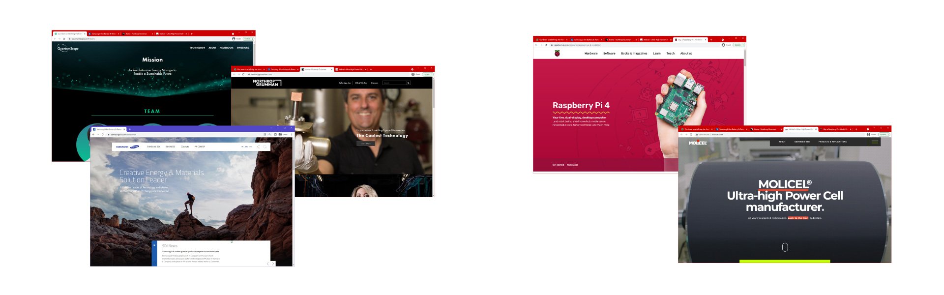
LEFT: competitor websites. RIGHT: websites to aspire to.
Development
Early in the process, the existing AER logo was identified as out of step with where the company was headed — its style didn't match the transparency positioning the rest of the brand needed to carry, and a redesign was proposed. At the same time, the visual idea that would end up defining everything else was already present in the earliest moodboards: transparency taken literally, expressed through line art and x-ray imagery rather than through metaphor alone.


The Idea That Held
The strongest concept in this project — literal transparency, rendered as x-ray imagery — showed up in the very first moodboards and never really left. Nothing here is a story of discarding three failed directions before finding the right one; it's closer to the opposite, a case for recognizing a strong idea early and having the discipline to develop it fully rather than manufacturing alternatives just to prove the process was rigorous.
The logo rejection fits the same pattern: not reworked for its own sake, but rebuilt because it didn't yet carry the one idea everything else in the system was already committed to.