
ARCIMOTO Dashboard
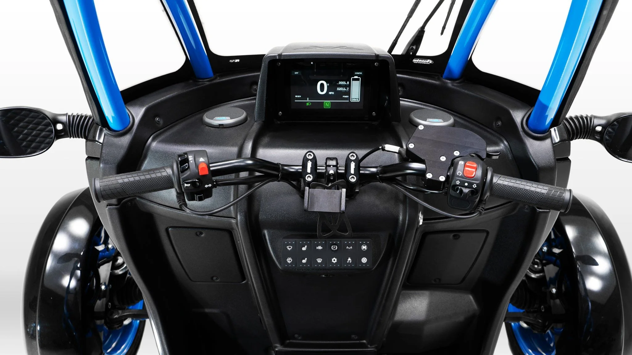
CONCEPT ART, DESIGN LANGUAGE, MOCKUPS & PROTOTYPING (VIRTUAL & PHYSICAL)
DISCIPLINE(S): UX/UI Design, Graphic Design, Interaction Design
ROLE: UX Designer, Senior UX Designer
SKILLS & TOOLS: Sketching, Photoshop, Illustrator, Solidworks
An electric vehicle's dashboard has subtle requirement changes from its combustion engine brethren. Across four generations, I owned that problem as Arcimoto's exterior kept changing around it, and as the tools available to solve it changed too, from physical material layers to a single digital screen.
Problem/Opportunity
Electric vehicles convey slightly different information from what users are accustomed to. There are typical battery-related elements, and in the Arcimoto vehicles in particular there is a mandatory emergency-brake warning requirement, since the motor doesn't lock the way a gas engine does when the vehicle is off.
Before certain regulations changes, and before appropriately-sized, affordable screens were ubiquitous, displaying custom, individually-lit icons meant solving the problem with physical material engineering, not software, a fundamentally different design challenge than what later generations would face.
Goal
Design dashboard systems, across four generations, that made EV-specific information (battery charge, power draw, brake-engagement state) as legible as a gas car's dashboard makes its own information.
As display technology matured, migrate that same information architecture from a physically-constructed lighting system to a single digital screen, carrying years of layout thinking forward rather than starting over.
Impact
Four generations of dashboard work, spanning a genuine shift in what "designing a dashboard" even meant, from material science to interface design.
The underlying information architecture never had to be reinvented, only re-hosted, first in plexiglass and LEDs, later in pixels.
Act One: Solving With Layers
Information No Gas Dashboard Had
The earliest concepts had to answer a question conventional dashboards never faced: what does an electric motor's driver actually need to see?
Early ideas substituted an amp-meter for a traditional RPM gauge, and some linked it visually to the battery charge indicator, filling and emptying in opposite directions, to keep the driver conscious of both driving habits and remaining range. That emphasis made sense given the numbers involved, the earliest battery packs offered a fraction of a gas tank's range, with a further emergency reserve available at the cost of long-term battery health.

LEFT: Visually highlighting the amp-meter and linking the effect of higher levels on battery charge: the amp-meter fills in the same direction as the battery percent gauge empties. As number of amps increases and battery percent decreases, the meters change colors accordingly. RIGHT: Early Gen3 dashboard gauge concepts.
The First Physical Solution (Gen3)
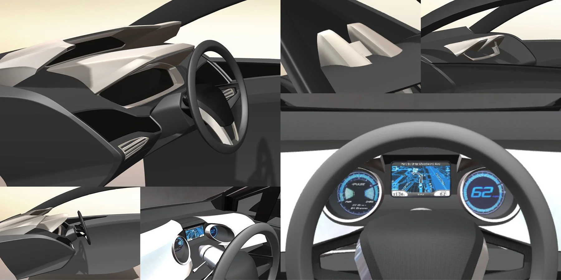
Later concepts simplified considerably, dropping the amp-meter for a split dash design, with gauges housed in two recesses flanking the steering wheel and an off-the-shelf speedometer part. This version of the dashboard was finalized and incorporated into the original “Pulse” concept, the first Arcimoto vehicle to be shared to the public. The dashboard driver-facing surfaces included a backlit transparency sheet masked into icon shapes, the first version of a construction technique that would carry forward for years.
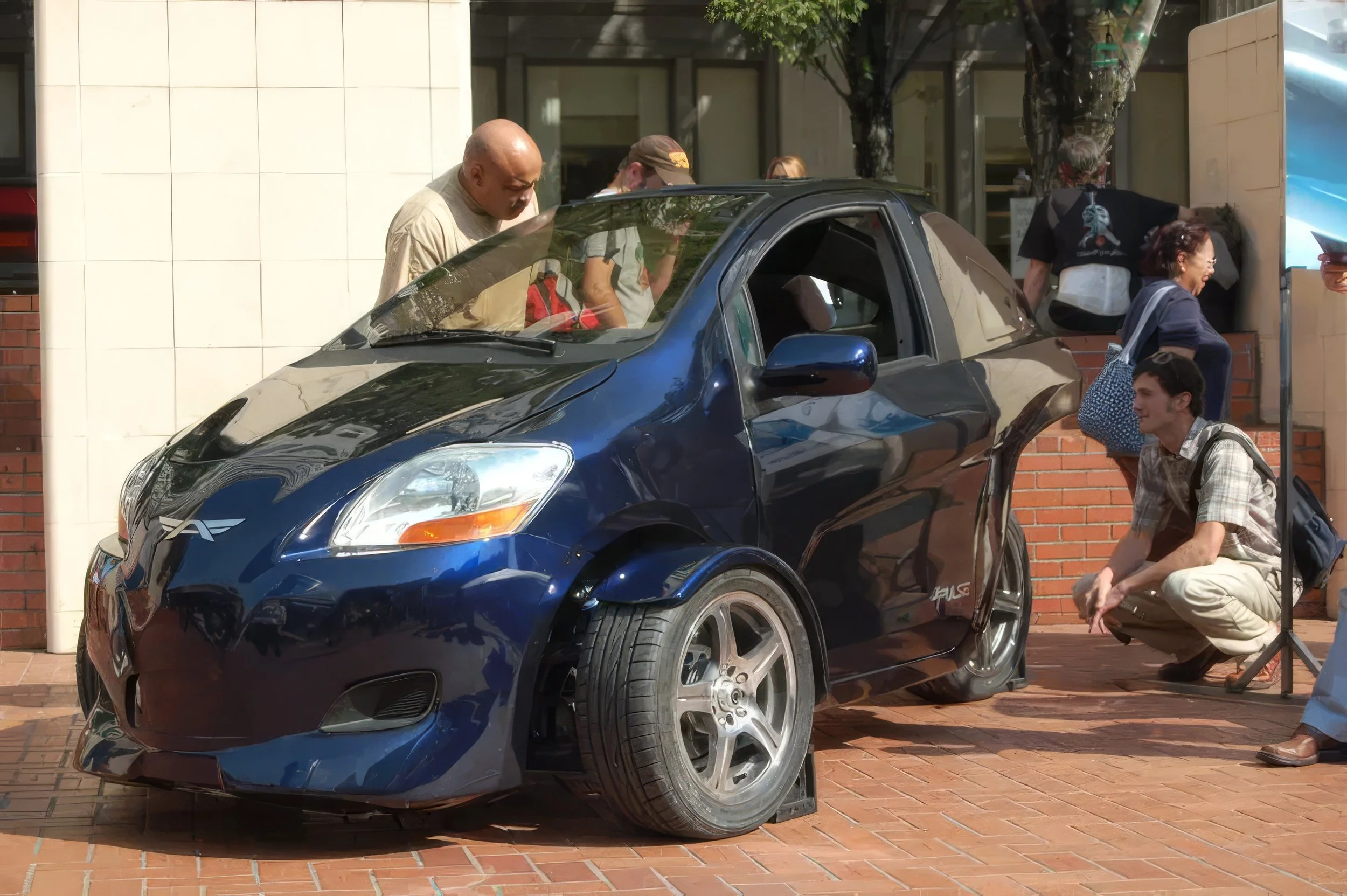
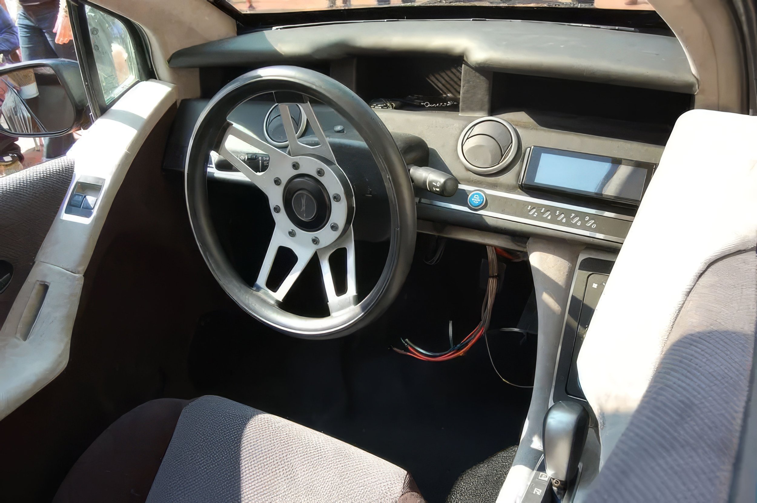

TOP: The two dash pods envisioned for Gen3. LEFT: Dashboard iconography and visual cues. RIGHT: A 3D view of the layers necessary to produce the dashboard imagery: a transparency sheet with blocks of color (backlit by individual LEDs), followed by two sheets to mask out the icon shapes.
Refining the Process (Gen4)
Dropping the horizontal split view design utilized on earlier concepts, Gen4 saw incremental advances in dash layout design, and major steps forward in methods of real-world construction and implementation. Methods for creating an interior experience comparable to that of major-brand vehicles were devised and refined.

Dash concepts during this phase were heavily inspired by the possibilities of edge-lit etched plexiglass, which carried a uniquely futuristic and stylish appeal. Most concepts included some form of the technology to display dash elements that were not required to change dynamically.
Earlier concepts featured rotating needles similar to those used by many production vehicles for conveying vehicle speed and RPM. Later concepts would drop these, aiming for the simplicity and sleekness conveyed by simple numbers.

An earlier concept depicting the layers necessary to incorporate the edge-lit plexiglass idea: icon sheet backlit by individual LEDs below, and etched plexiglass on top. TOP RIGHT: Real-world photograph illustrating the etched glow effect.

LEFT: A collection of speedometer styling experiments. RIGHT: Experiments in relaying information via low-fidelity dot matrix displays.
The creation of professonal-quality dashboard elements was an involved process. Numerous layers of materials were required to achieve the appearance, and much research went into selecting the proper OEM components to suit our needs. Below is an example of the layers required for one concept devised midway through Gen4's development.

A: The lowest layer, featuring the OEM LCD components used for depicting the speedo, battery level, and various other bits of information.
B: The layer of LED lights for backlighting icons.
C: A thicker layer of solid material, meant to eliminate LED backlight bleed from one icon to another.
D: A transparency layer with translucent colors corresponding to the icons that would be masked out with ...
E: a transparency layer colored solid black except for the icon shapes.
F: The top layer of edge-lit plexiglass.

An assortment of dash layout ideations
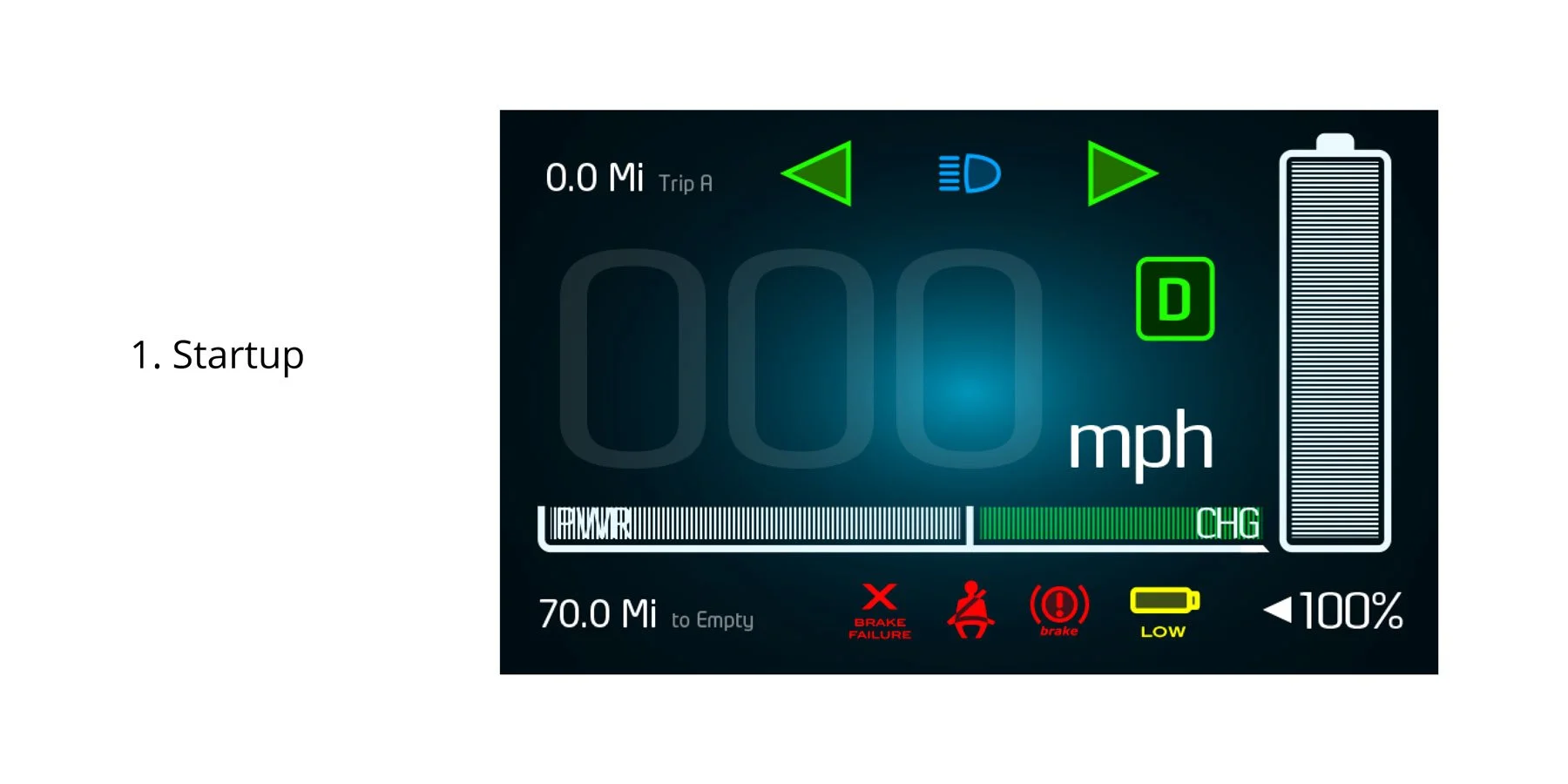
Despite sharing many characteristics with typical vehicles, the Arcimoto EVs have always differed in various ways, necessitating atypical information to be passed to the driver. For example, given that the engine doesn't 'lock' in the same way that gas engines do, the Arcimoto EV requires the use of the emergency brake at all times to prevent the vehicle from traveling unexpectedly while turned off. The following slideshow depicts the informational changes revealed to the driver during a session of startup, driving, and turning off the vehicle.

A: Off (Charging)
B: Startup
C: Welcome Screen
D: Normal Operation
E: Off (Engage Brake Warning)
Culmination of a Construction Method (Gen6)
The dash design process for Gen6 went quite quickly, following up as it did on the extensive work done during Gen4. After development of the dashboard surfacing was complete, it took relatively little time to develop a working concept for the layout of gauges and other information to be housed within.
This would be the last time a dashboard was constructed in the original layered method devised during Gen3.

A: An off-the-shelf motorcycle speedometer component to be placed within the dash structure. B: A layer of etched plexiglass to convey unchanging visual elements and provide a shield for the components behind. C: A transparency layer with shapes for icons in appropriate colors, to be placed behind the plexiglass layer.
Act Two: Solving With a Screen
A Digital Direction (Gen7, Gen8)
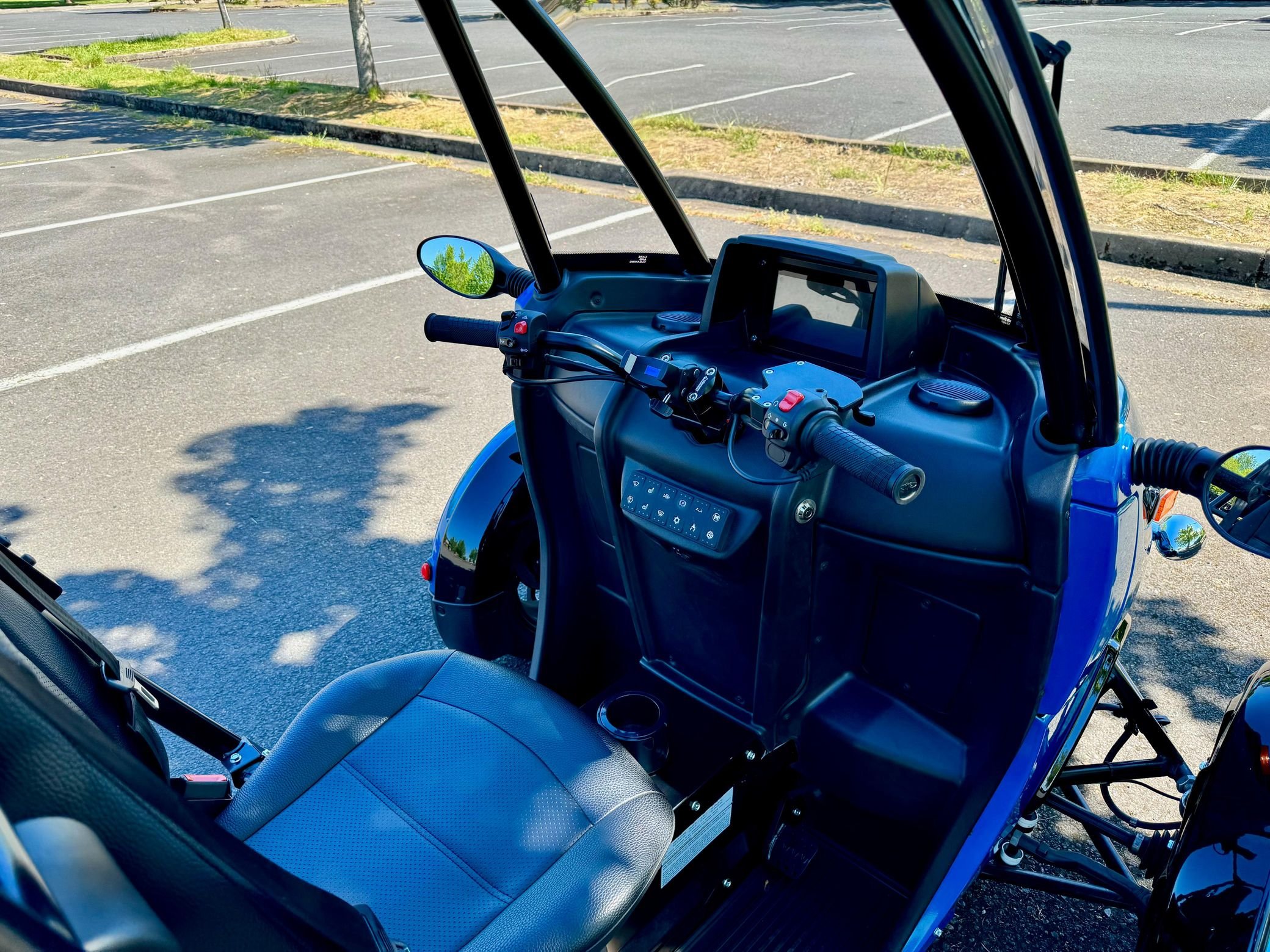
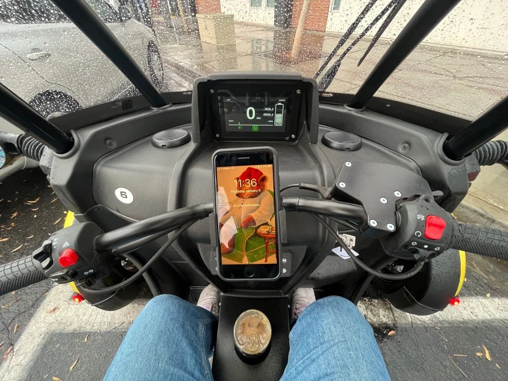
Starting with Gen7, the individually-lit, physically-separate icons that had defined every prior generation consolidated into a single screen, typically 5 to 8 inches diagonal. This didn't just simplify fabrication, it removed a whole category of physical constraint. Years of layered-material problem-solving gave way to a design surface that could change with a software update instead of a new set of masks and LEDs, opening up visual possibilities the physical system never allowed.


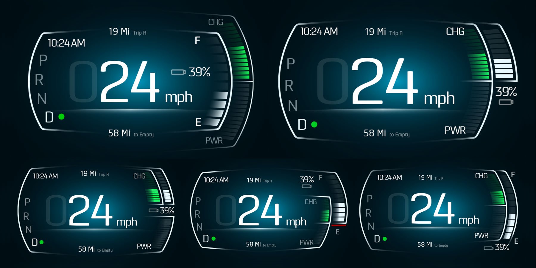
A number of concepts exploring slight changes within a coherent visual aesthetic.
Later UI work was developed explicitly with phone and tablet screens in mind, including early exploration of a personal device doubling as the vehicle's key, a natural extension once the dashboard itself was already speaking the same digital language as the devices in a driver's pocket.


The Throughline
The real story across these four generations isn't any single dashboard, it's watching the same underlying question — what does this driver need to see, right now — get solved by two completely different means without ever being reinvented. Gen4 and Gen6 answered it with LEDs, transparency layers, and etched plexiglass, a genuinely physical problem, solved with physical tools.
By Gen7, the same question was being answered on a single digital screen, with a phone in the loop as a plausible next step. What changed was the medium. What didn't was the job, carrying accumulated layout and information-hierarchy thinking across that shift, rather than discarding it every time the tools underneath it changed.
For the exterior story running in parallel across these same generations, see ARCIMOTO Electric Vehicles: Adaptation Across Six Generations of Strategic Reinvention.