
GENOVATION Electric Supercar GUI

VISUAL DESIGN LANGUAGE, MOCKUPS & PROTOTYPING, FINAL ASSETS
DISCIPLINES: UX/UI Design, Motion Design, Graphic Design
ROLE: Senior UX Designer
SKILLS & TOOLS: Sketching, Illustrator, Photoshop
Genovation, an electric vehicle company based in Rockville, Maryland, was fine-tuning the GXE — a limited-edition, all-electric conversion of the Chevy Corvette built to deliver a premium experience in every respect. Working for Stafl Systems, LLC, I developed a dashboard infotainment system and gauge cluster to replace the stock Corvette variants.
Problem/Opportunity
The stock Corvette dashboard gauges were fixed hardware, offering no customizability — replacing them with a high-resolution screen unlocked full visual flexibility, but that flexibility had to be designed, not just enabled.
The interface had three audiences to satisfy simultaneously: it needed to read as a sports car (luxury, performance), read as distinctly its own brand, and — depending on which direction the project was in — either stand apart from or blend into the Corvette's own established interior design language.
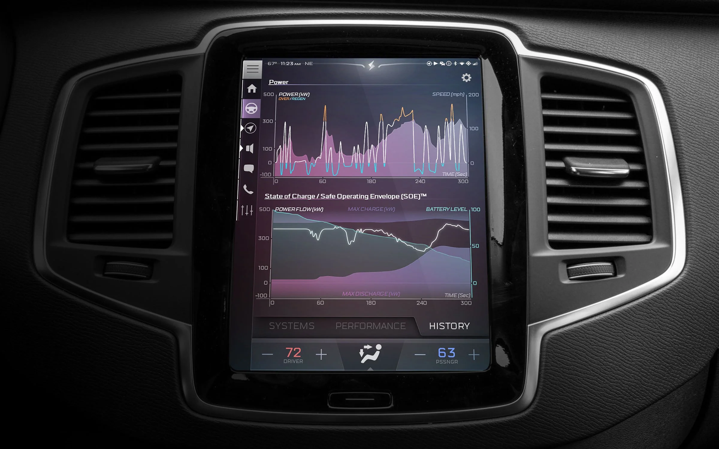
As a high-performance EV, the car needed to present detailed battery information in a way that stayed genuinely easy to understand, not just technically accurate.
Goal
Design a GUI system flexible enough to demonstrate real customizability (illustrated through three distinct gauge visual styles) while converging on one final direction disciplined enough to feel like a finished product, not a tech demo.
Determine, empirically rather than by preference, how much larger the replacement screen could realistically be — balancing more visual real estate against fit within the existing cockpit.
Impact
Final GUI shipped across a limited-edition production vehicle, replacing 100% of the stock gauge and infotainment experience.
The HVAC interface, developed as one component among many, ended up defining the visual language applied to the rest of the system — a single subsystem doing double duty as the de facto style guide.
A full independent platform — app library, notification system, real-time battery integration — was designed and built out before being deliberately set aside once a better strategic direction became clear, rather than shipped on inertia.

ABOVE LEFT: As a high-performance electric vehicle, detailed battery information presented in an easy-to-understand way was a crucial requirement.


Adopting an understated but elegant visual style, the Genovation GUI employs a dark stage background, borrowing cues from the chrome accents found elsewhere in the Corvette interior design language and employing strategic touches of bright color to draw the eye.


ABOVE LEFT: As a high-performance electric vehicle, detailed battery information presented in an easy-to-understand way was a crucial requirement.
Preliminary Research
The project split into two parallel tracks from the start. The first was physical: the stock Corvette screen was replaced with a larger one, but "larger" wasn't a free decision — it required in-the-field cockpit analysis alongside a detailed 3D model to determine how much real estate could realistically be reclaimed without compromising the interior.

An early photo-manipulation illustrating the proposed shift from the stock screen to a larger one.
Analysis of the Corvette cockpit was conducted, using both in-the-field testing and a highly detailed 3D model, to determine how much real estate could realistically be diverted towards a larger screen. After settling upon a screen size, the interior CAD was then modified to house it, and a representative screenshot taken for use in GUI development.

LEFT: In-the-field analysis of possible screen real estate, and an early illustrative GUI prototype. RIGHT: At one point, a fairly tall screen was suggested, the top of which could serve as a section dedicated to track or other performance-specific data. In the end, a slightly more modest screen size was chosen ("only" twice the size of the stock screen).
The second track was research into the current state of automotive GUI design, using a Kobayashi Chart to map different visual and functional approaches against descriptive language.
From here we evaluated which of those approaches would actually serve the project's goals rather than defaulting to whatever looked most "premium" in isolation.

A "Kobayashi Chart", upon which the images above are superimposed, can provide a (somewhat generalized) guideline of descriptive words with which to assign different visual and functional approaches to any design-related project.
Ideation & Development
Early concepts prioritized structural decisions — element placement, color palette — over polish, deliberately leaving detail work rough until the broader direction was settled. At this stage, the plan was to build a Stafl Systems- or Genovation-branded experience with its own visual identity, distinct from the Corvette's established styling cues, rather than working within it.


A full set of screens, exploring an early color palette eventually deemed a little too cold and dropped for a warmer approach

With visual real estate at a premium on the smaller standard automotive touchscreen, methods to effectively convey things like HVAC settings requires a fair amount of iteration

Testing different visual styles for system tabs
Final v1: Stafl Systems / Genovation Branding
This direction was developed into a genuinely complete, independent platform, not a rough concept. The touchscreen system supported a library of installable apps that a user could add, remove, and reorganize, with icons running along the left edge of the screen.
A "paper doll" visual element showed real-time vehicle status across multiple possible states, with a home screen built around it. Dragging the system's icon down revealed a notification drawer with settings and app shortcuts. The platform integrated directly with Stafl Systems' own Battery Management and Embedded Control products, surfacing real-time battery pack performance and system data as one of its core app experiences — alongside dedicated map, HVAC, and media screens, all built with responsive layouts so the same GUI could scale across smaller or larger displays. HVAC specifically required heavy iteration, since conveying settings clearly on a standard automotive touchscreen meant working within real visual real-estate constraints. This was a full, shippable product platform — not a placeholder.
The Touchscreen System makes use of a library of available apps that can be added, removed and reorganized as the user sees fit — icons for which are visible along the left side of the screen.

A possible Home screen, showing real-time vehicle status indicators via ‘paper doll’ visual.
MIDDLE: Dragging the top company icon downwards reveals a notification drawer with a range of settings and app shortcuts.

Different visible states possible via ‘paper doll’ visual element.
From Stafl Systems' website: 'A versatile touchscreen display system, providing an interface for displaying real-time data...Stafl Systems touchscreen displays are suitable for vehicles, stationary storage, industrial equipment and more. Coupled with a high-performance graphics engine, our capacitive multi-touch displays enable a wide variety of interactive user interfaces with beautiful, responsive visuals.'

ABOVE LEFT & MIDDLE: Apps tailored to enable maximum performance. ABOVE RIGHT: 'Integrated with the Stafl Systems family of Battery Management and Embedded Control products, our touchscreen displays provide real-time battery pack performance and system data.'
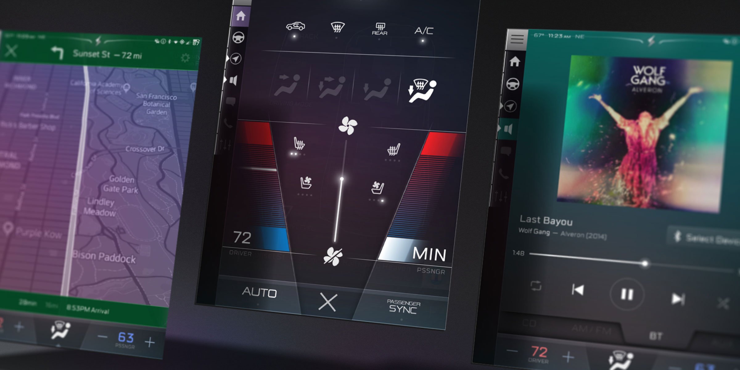
Map, HVAC, and Media Screens

Examples of responsive design — allowing a single GUI to fit on smaller or larger screens depending on need.

ABOVE & BELOW: Alternative visual language styles explored while the GUI was still to be branded as a third party from the Corvette.

Brand Pivot & Refinement
Genovation ultimately decided that a visual style aligned more closely with the Corvette's own established design language would produce a more cohesive product — better suited to the luxury positioning the car was built around — than a third-party-branded system sitting on top of it. The bones of the independent platform built in v1 was kept, but the layout and visual styling were reworked from the ground up.
My initial sporty, stark ideas in this vein, developed specifically around Corvette's own visual cues rather than apart from them, presently made way for a darker, more elegant style.

A full set of screens, exploring an early Corvette-specific look and feel.

One of the elements deemed most important for the Home Screen was a graphical representation of the vehicle, intended to relay status and performance updates in real-time.


The Home Screen's real-time graphical vehicle representation remained one of the most important single elements through this transition, since it was the primary channel for status and performance feedback at a glance. The HVAC system, already the most heavily iterated component from this phase, carried its visual language forward and continued to define the rest of the interface — its interaction model evolved further too, moving from an early expandable "drawer" pattern to a full-screen modal.

Earlier versions of the HVAC system featured an expandable "drawer"-type functionality. Eventually, this became a full-screen modal instead.
BELOW: An alternate appearance explored a more "digital" look, ultimately retired in favor of the Final Product shown at the start of this case study.

The Platform That Got Set Aside
The most consequential decision in this project isn't visible in the final shipped product at all. An entire independent, Stafl-branded touchscreen ecosystem was designed and built to genuine completion: an app library, a notification system, live battery-management integration, responsive layouts across screen sizes.
None of this was rough or speculative: it was a real, working product direction. Setting it aside once Genovation's actual strategic need became clear meant absorbing real sunk cost on a fully-realized system in favor of the direction that actually served the car. That's a harder call than abandoning a rough sketch, and it's the clearest evidence in this project that the final product was chosen on its merits.